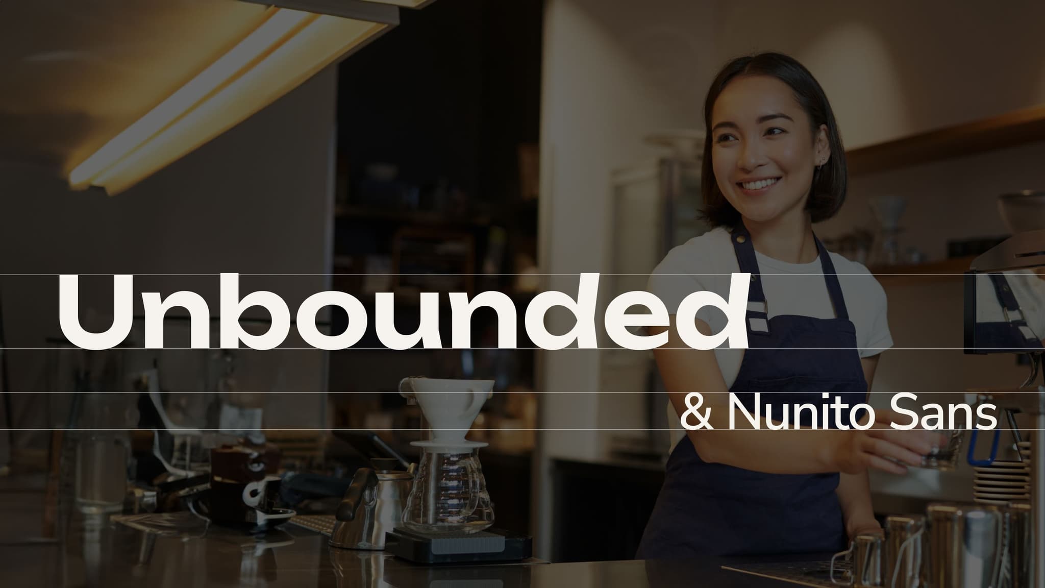
Typography

Primary typeface
Unbounded is the primary font of Pao Cafe, chosen for its modern, youthful character while maintaining balance and elegance. Its rounded shapes convey approachability and warmth, while ensuring excellent readability across sizes. With a full range of weights from Regular to Extrabold, Unbounded allows flexibility in communication - from bold headlines to detailed body text - creating a consistent and impactful visual identity for the brand.
Secondary typeface
Nunito Sans serves as Pao Cafe’s secondary font, complementing Unbounded within the identity system. Its clean, balanced, and highly legible design makes it ideal for longer texts, printed materials, or communication assets requiring clarity. With a wide range of weights, it ensures consistency while conveying a sense of friendliness, modernity, and professionalism.
Leading
Leading in typography refers to the vertical spacing between lines of text, measured from the baseline of one line to the baseline of the line below.
Setting appropriate leading ensures the text feels comfortably spaced – not too tight, which makes content heavy and hard to read, and not too loose, which disrupts the reading flow. Proper line spacing plays an important role in improving readability, clarifying information hierarchy, and creating a balanced, professional visual experience.
Leading for Primary Typeface
When used for headlines, Unbounded – Pao Cafe’s primary font – works best with tighter leading, emphasizing strength and delivering a bold visual impact. Since headlines are usually short and intended to capture attention, reducing the vertical spacing helps the layout feel cleaner, more cohesive, and more striking.
We recommend setting leading at around 120–130% of the font size to ensure clarity, harmony, and aesthetics. For multi-line headlines, the leading can be flexibly adjusted to suit the composition and design proportions.
Leading for Secondary Typeface
When used for body text, Nunito Sans requires open and generous line spacing to ensure comfortable readability, especially in layouts with high information density.
With its open and friendly letterforms, Nunito Sans works best when line spacing is slightly increased, allowing the text to “breathe” and creating a sense of balance and clarity.
To optimize legibility, we recommend setting leading at 120–130% of the font size, maintaining harmony and ensuring a pleasant reading experience.
Hierarchy
Typography hierarchy is the intentional arrangement of text elements to guide the eye and indicate the importance of information. By adjusting size, weight, color, spacing, and style, the hierarchy system creates a clear visual structure, helping readers quickly scan and easily understand content.
In Pao Cafe’s brand identity, Unbounded is used for headlines and key visual highlights, bringing strength, modernity, and character. Nunito Sans is applied to body text and detailed information thanks to its readability, minimalist form, and approachable feel. This combination creates a coherent visual order that ensures both aesthetic appeal and effective communication.
